There’s a particular type of late medieval document that we call a Biblia Pauperum. We call it that because at some point in the nineteenth century scholars started calling it that, but “Bible of the Poor” is not very descriptive: there’s nothing about these books that suggests the intended audience is either especially poor or illiterate. What makes something a Biblia Pauperum is that it’s a typological juxtaposing of Old and New Testament images, and it’s printed as a blockbook. So it’s got a particular content (juxtaposed biblical imagery) and is produced by a particular technology (blockbook printing).
What’s a blockbook? The pages of a blockbook were made by (relief) printing an entire page from a single block of wood, on which were carved both the pictures and the words. It was a fascinating technology that competed with movable type for a while before losing decisively. One of the things lost when blockbook technology was sidelined is the ability to combine words and pictures any way you want to. Movable type is wonderful, but it tends toward segregation of words from pictures.
The best thing about the Biblia Pauperum is the way it didactically displays Old and New Testament images to convey the figural relation between them. Reading a Biblia Pauperum intelligently means firing up the analogical imagination and seeing how typology and prophecy bind the Bible together.
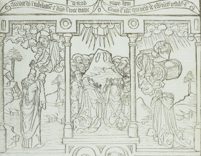
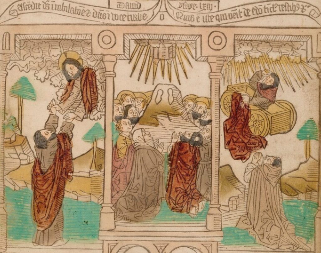
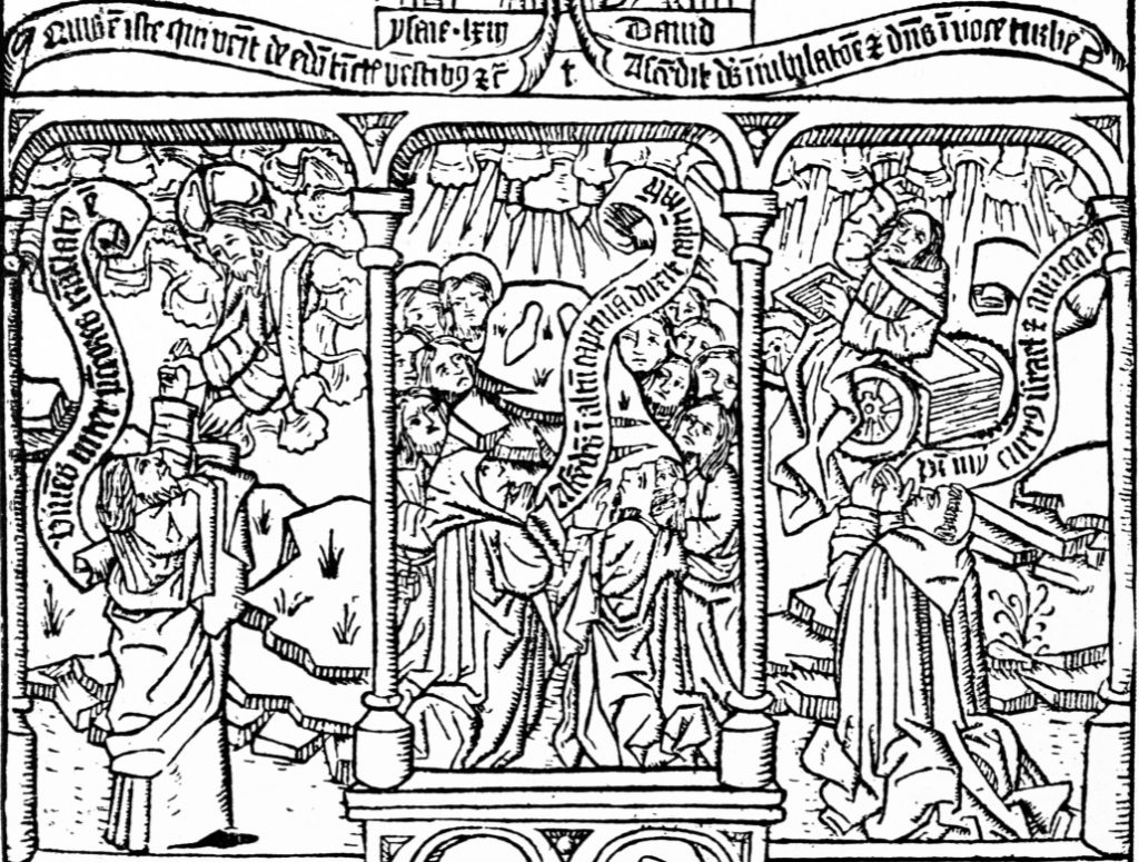
Just a few years ago, the only way to study the Biblia Pauperum without getting access to special collections was to read exactly one published edition, Avril Henry’s from Cornell Press. It’s still great, especially because of Henry’s running commentary; if you can nab a copy at a reasonable price, do it. But in recent years, several museums and libraries have made digital facsimiles available for viewing as well. Here are three different varieties of Biblia Pauperum; for easy comparison, I’ve picked out the image of the ascension of Christ:

This wonderfully clear printing is from the Library of Congress. Here’s how to read a Biblia Pauperum: The central image is a scene from the life of Christ. In this case, he has ascended from the mountain, leaving his footprints and his disciples below. To the left and right are Old Testament types and figures: Enoch and Elijah going up.

This colorized edition from the Bodleian has nearly identical layout, but if you study any individual figure you’ll see it’s been re-drawn or re-carved, with some loss of clarity. The color, laid in in rather clumsy blocks, adds a lot of initial appeal, but muddies the details.

This one from the Warburg Institute adds a great deal of wonderful detail and precision (words everywhere), but loses visual coherence and simplicity.
I’ve intentionally left out a lot of other things that are happening on each of these pages. Click through the institutional links if you want to spend a little time looking at the pages in greater detail. There are prophets and word balloons and descriptions galore surrounding the bits I’ve clipped here.