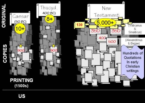
We usually think of charts and graphs as presenting “just the facts,” but in reality every chart is biased. Charts are based on prejudices, advance judgments about what should be represented, what should be suppressed, and how the information should be displayed. When you look at a graphical display of information, you are getting the graphic designer’s version of the numbers just as surely as you are getting the author’s point of view when you read sentences. This is no reason to stop trusting graphics, unless you are currently trusting graphics uncritically. It’s just a call to think critically and to appreciate the amount of thought that goes into building arguments with charts and graphs.
Nobody has said more helpful and interesting things about this than Edward Tufte, who brings a powerful dose of common sense to an often too-theoretical field known as visual rhetoric. If you haven’t heard of Tufte, go dig into his books like The Visual Display of Quantitative Information, Envisioning Information, Visual Explanations, and most recently, Beautiful Evidence. Just the titles are eye-opening; imagine what’s in the books themselves.
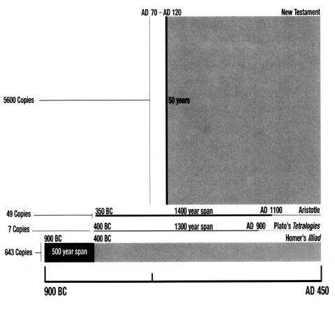
I’ve struggled with visual explanations a lot, especially when I’m presenting complex subjects to popular audiences. Take, for example, the arcane, specialized discipline of textual criticism. Christians deserve to know that the documents of the New Testament are reliable, but who is sufficient for the task of explaining the evidence? In his classic book on the subject, The New Testament Documents: Are They Reliable?, F. F. Bruce sums up the data thus: “The evidence for our New Testament writings is ever so much greater than the evidence for many writings of classical authors, the authenticity of which no-one dreams of questioning.”
He’s right. But think about what that judgment presupposes: A grasp of how much evidence we have about ancient authors in general, and an ability to compare those ancients with the New Testament. If Bruce’s reader can pull off that comparison mentally, he will see that Bruce’s confident assertion is right.

Recently, however, I came across a truly effective graphic display of information which puts Bruce’s point into visual form with an elegance that would make Tufte proud. Look at the way the information is organized here: 
The designer responsible for it is Doug Powell, and it can be found in his book The Holman Quicksource Guide to Christian Apologetics.
The Guide is a lavishly-illustrated intro to the whole field of apologetics, which is sort of my point here: nifty graphics can carry apologetic arguments in themselves. Information isn’t just for displaying in whatever pie chart or bar graph happens to be spewed forth by the default settings on your Microsoft product. Information can be displayed effectively, persuasively, and elegantly. We can’t all design charts so good that they pack an argumentative wallop; but we can all think more critically about the charts that are shown to us. In a culture where so much persuasion occurs through the eye, critical visual thinking is one of the most important kinds of critical thinking.