Imagine being an artist commissioned to illustrate the entire Bible. From the epic stories to the pithy proverbs, from psalms of praise to prophets of doom, from the life of Jesus to his parables, you were supposed to produce pictures for everything. Now imagine that you were limited to the most minimal of visual means for representing all those stories: stick figures. You’d be doomed to producing a forgettable set of doodles. A real why-bother heap of lines, right?
 But back in the 1960s, Swiss artist Annie Vallotton took up that task and gave us a memorable body of work. I’m talking about the roughly 500 illustrations that have always accompanied the Good News Bible. They are instantly recognizable. They have made an impression on people who can’t remember what translation they belonged with, and who certainly couldn’t tell you the name of the artist behind them.
A few years ago, HarperCollins calculated, and the BBC duly reported, that Annie Vallotton was the best-selling artist of all time. Since her work had gone out with every copy of that ubiquitous Good News Bible, it was a simple matter of numbers: 500 pictures times 140 million copies equals about 70 billion Vallotton illustrations.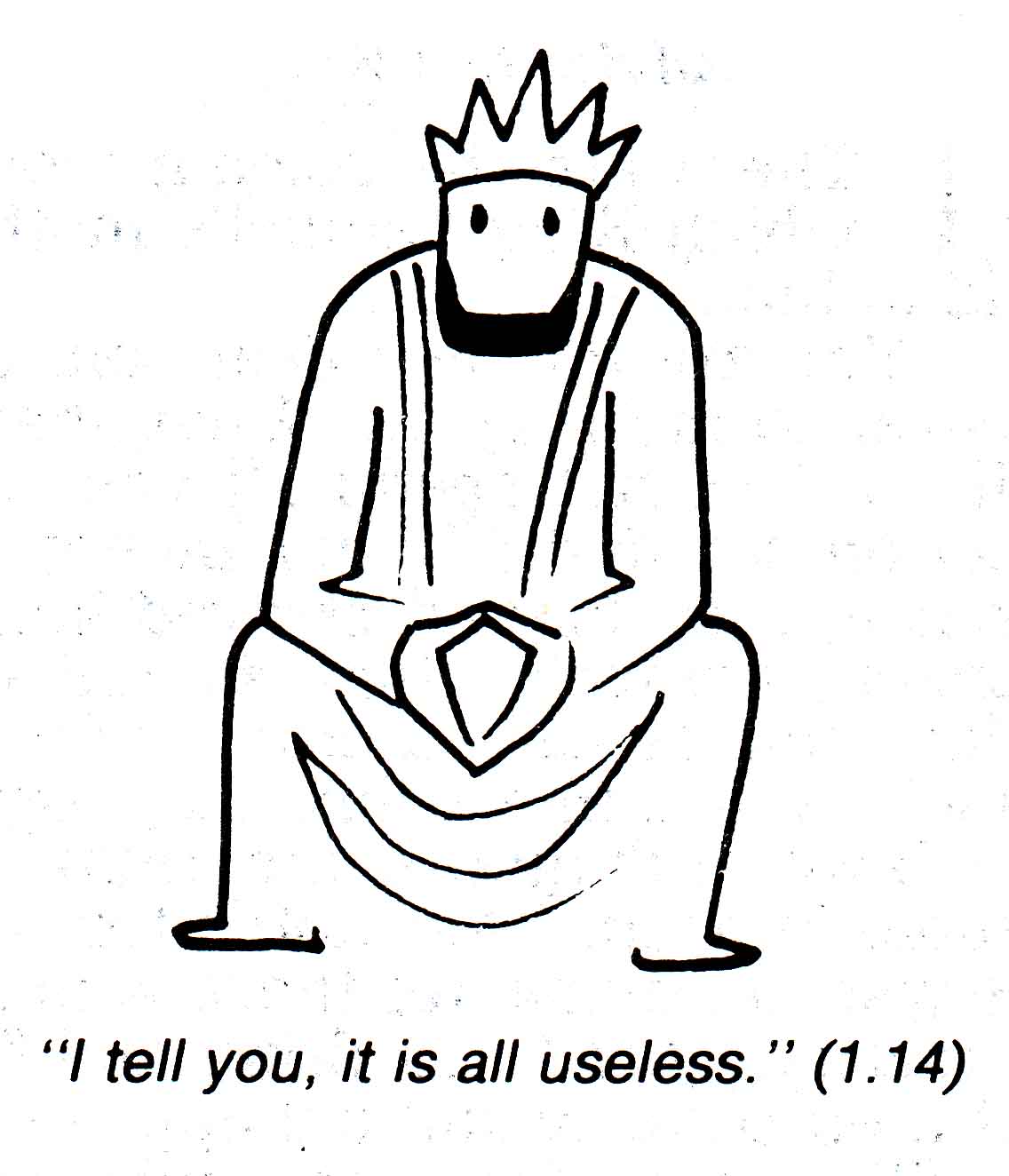 That’s sort of an inflationary way of handling the numbers, of course –count every copy of each image, and I’m sure there are multiplied billions of Garfields and Marmadukes at large as well– but the point is that Vallotton’s pictures have had wide circulation.
And more to the point, they are good. They’re good as line art, and they’re good as Bible illustrations. You can see little thumbnails of all the illustrations online, but here are a few that show off her strengths as an illustrator. The wise but sad king of Ecclesiastes (left) is a perfect example of an image that doesn’t get in the way or distract the reader, but also presents a lot more to look at than just a sad face. The figure presented here is pensive. His head is placed just low enough on his shoulders, his hands have just the right amount of tension, and the fold of his robes fall in that brilliant melting-Z line. Any more would be less; less here is more.
Vallotton mostly avoids drawing vast, panoramic scenes. She doesn’t draw God, and she rarely chooses to start a book with any sort of overall establishing shot. Again, that would draw too much attention. Instead, the illustrations sneak in. When she does go for a larger vision, the scenes are often symbolic. Here, for example, is a larger than average landscape from Ezekiel 6:
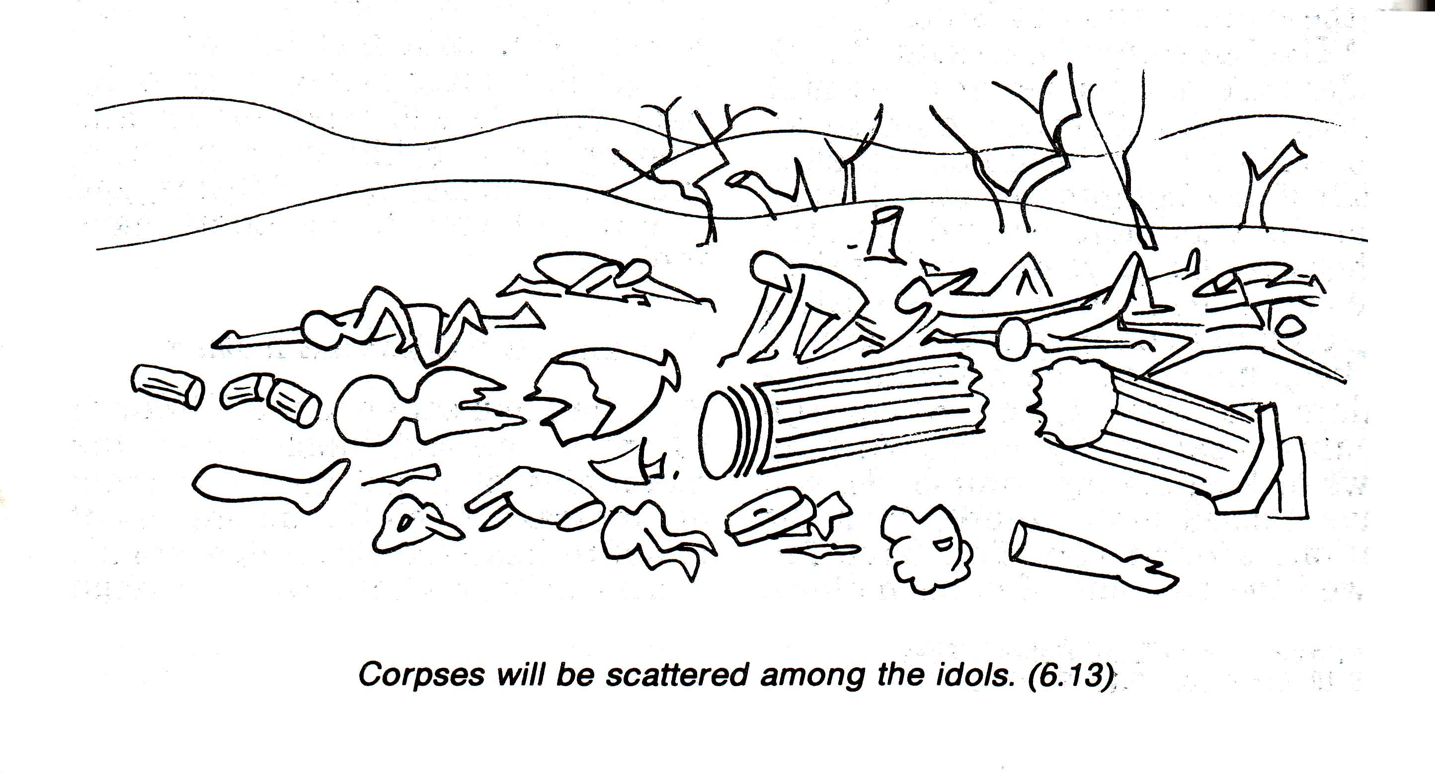 Some of the understated power of this picture comes from the artist’s refusal to distinguish clearly between corpses and rubble.
 Many of Vallotton’s images are so straightforward that it is hard to imagine any other approach to illustrating the concept. This is especially true when the Old Testament presents a theological truth in concrete terms. Vallotton’s scapegoat heads off into the wilderness. It’s a well-drawn goat (just over half a dozen lines), and it’s perfectly placed between the dots of the receding footprints and the single curved horizon line. The foreground, however, is the back of a human figure gesturing away from itself. If you think these people are too solid to be called stick figures, check out the bold left line of this one. From head to toe, that line could be made by bending a paper clip. That it nevertheless suggests un-stick-figure-like solidity is part of the Vallotton magic.
Indeed, Vallotton’s figures never quite settle down into being either solid or stick. They morph back and forth between the two. Sometimes (for instance in crowd scenes), her humans are obviously stick figures. But they tend to blend and mingle with other forms that are more nearly the outlines of fully-rendered drawings of the bodies:
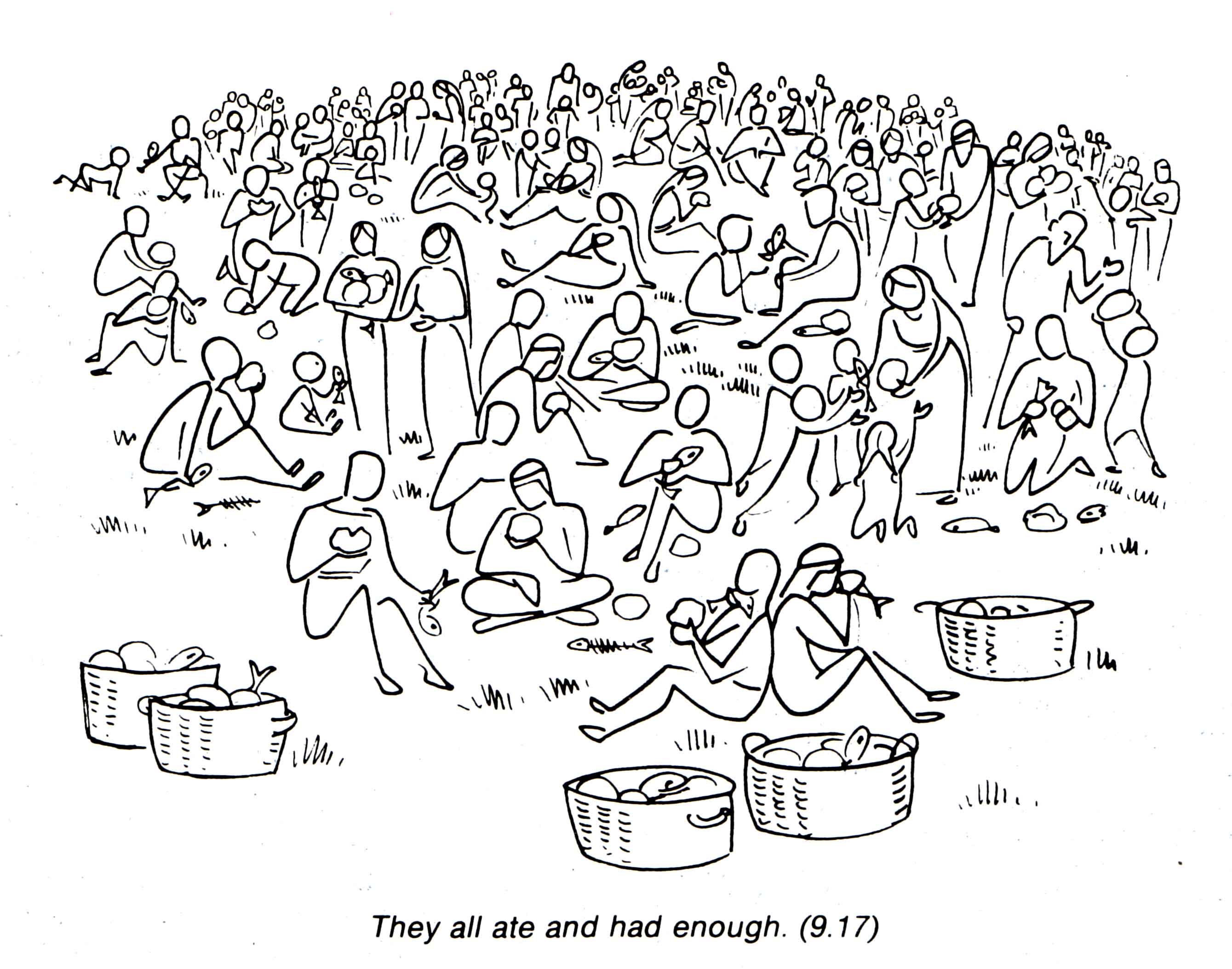
Visually speaking, a large part of Vallotton’s project in these illustrations is to catch her subjects somewhere in the transition from pictographic stick figures to fleshed-out portrayals of human forms. On the stick figure end of the spectrum, her line drawings are just a step or two above the simple shapes of letters and words; at the other end, they pull off a volumetric roundedness that make you think Vallotton must have made a complete drawing and then traced only the outlines.
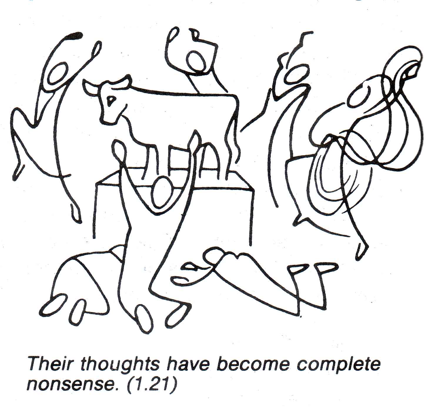 Even in the New Testament, when faced with an abstract statement of doctrine, Vallotton often takes recourse to Old Testament scenes. For example, when (Good News version of) Romans 1:21 says of those who dishonor God that “their thoughts have become complete nonsense,” Vallotton illustrates with the children of Israel inexplicably worshiping the golden calf at the very foot of Sinai. “Complete nonsense” is a translation that doesn’t exactly draw the mind back to the Biblical narrative: the whole point of the Good News version was to sound like “today’s language” circa 1970. But Vallotton’s illustration pulls the other direction, back into the canonical text. If she had drawn a hippy or a businessman, these illustrations would have become dated very soon. But her minimalism has kept them fresh and relevant for the most part. Personally, I associate them with the seventies, but that’s mostly a subjective repsonse; there are very few hooks in the drawings that link them to their decade of origin.
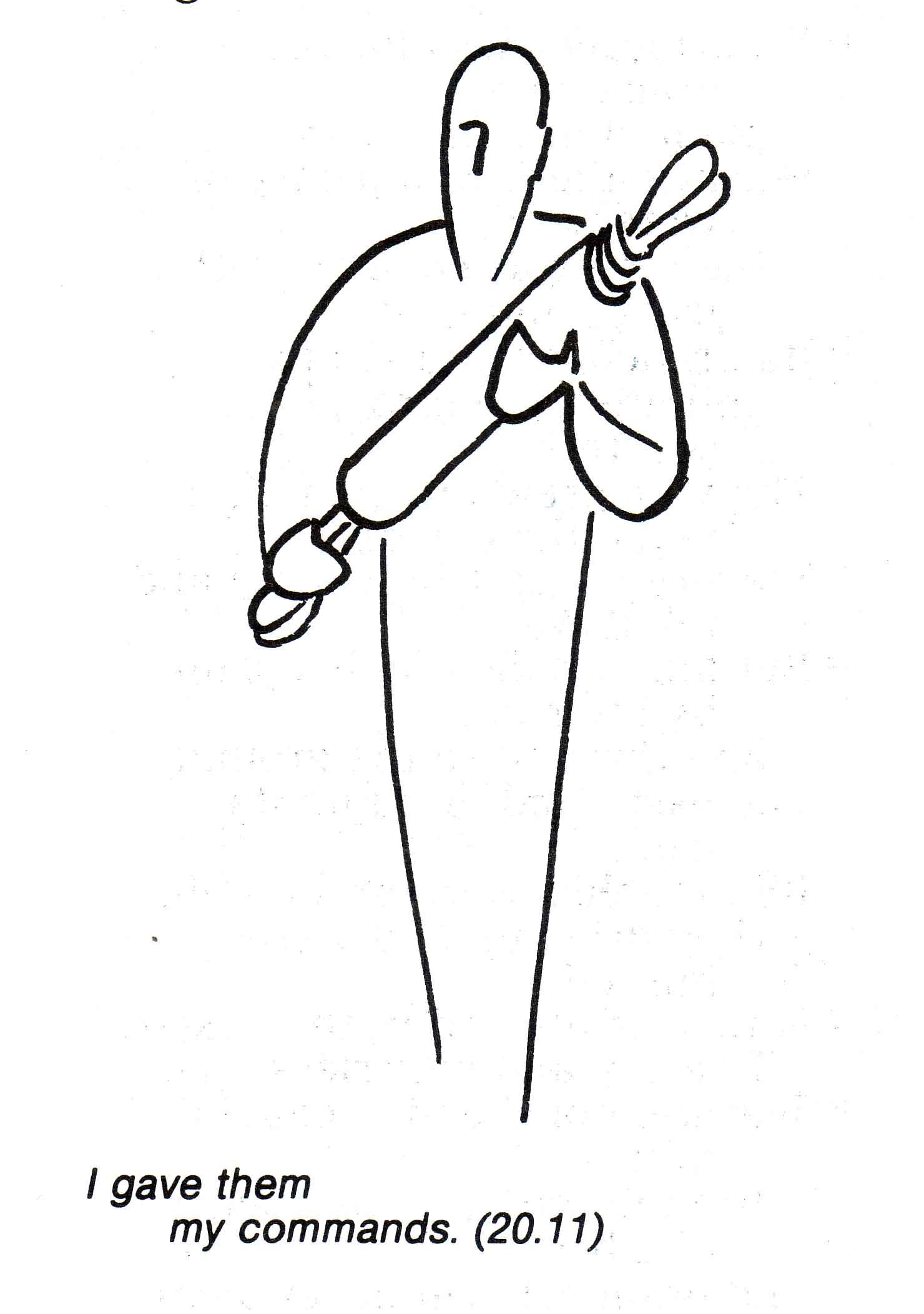
Vallotton tends to take a literalist approach to illustration, even for figurative and metaphorical language. When Jesus says that everyone who follows him will take up their own cross, Vallotton imagines it thus:

And confronted with parable, Vallotton always illustrates the events and characters of the parable itself rather than attempting an interpretation or application:
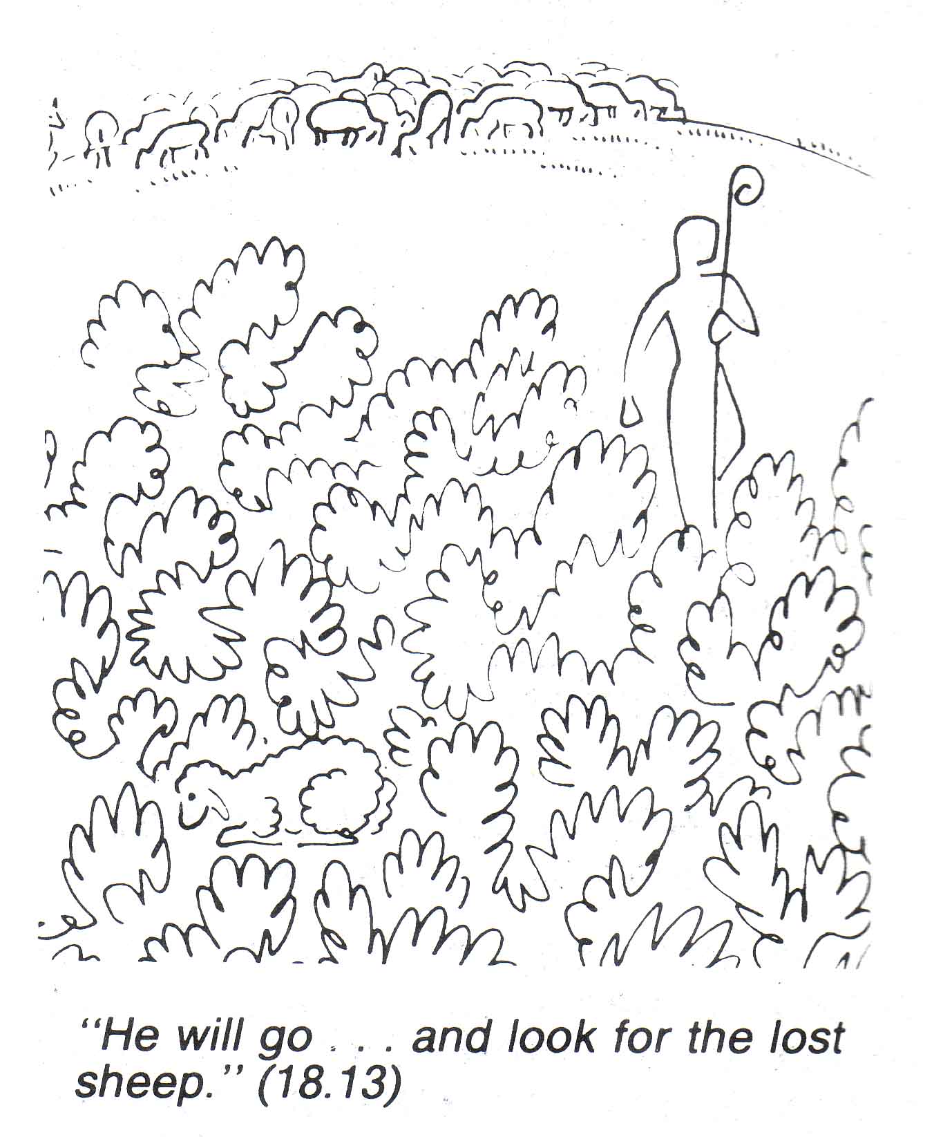
Sheep means sheep, as far as the task of the illustrator goes. Vallotton’s interpretive acts only go as far as depicting how the sheep could get so completely lost: by hanging out with sheep-shaped shrubs, of course. I didn’t try counting the lines in that drawing, by the way, but you’re welcome to. Because of Vallotton’s absolute clarity, it’s always possible to do so.
For Vallotton, “interpretation” was almost a bad word, at least when applied to the task of the illustrator. Her goal was to provide a kind of visual gloss, very close to the obvious and literal sense of the text, so that the viewer would be provoked to do their own interpretation and application. Here (from a January 1968 interview entitled “Bible illustration as interpretation,” from Bible Translator 19.1) is how she has described her approach to illustration:
An illustration automatically suggests an interpretation, and this is a danger where the Bible is concerned. That is why I have tried hard to make my illustrations a kind of ‘bait’ to arouse and develop interest on the part of the reader, and provoke questions in his own mind, to make him apply the text to himself, and to dip into the text still further. In a word, I want the illustrations to help the text become more alive and intelligible. All very presumptuous, you might say! Nevertheless, this is what I’ve tried to do. It seems to me so urgent that something should be done in this sphere.
Vallotton’s pictures really are perfect for the page. They can carry their message at any size on any page; they are easily moved around inside of text; they are cheap to print and they require no translation. One of the most famous images from the Good News Bible is Vallotton’s strikingly restrained depiction of the crucifixion:
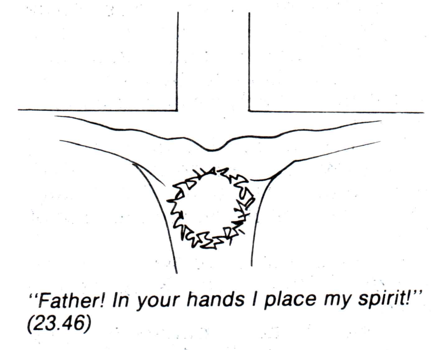 Eight lines do all the work here, and all of them could be described as simple lines except for the tortuously jagged line that circles around itself to indicate the crown of thorns. More would be less.
Then again, Vallotton’s pure line drawings have been colorized in some deluxe editions of the Bible. The addition of color makes them more friendly and inviting, and while it distracts from the sheer linearity of the drawings, it cannot conceal the fine drafting:

Something of the purity and severity of the Vallotton line is lost here, but the colorization does make a more immediately inviting page. If you can’t tell, I definitely prefer the starkness of the uncolorized line drawings.
Vallotton attends a Protestant church in Paris, and has an ongoing ministry of storytelling, especially for children. If you want to read more from Vallotton, and more recent than 1968, check out this interview at the Bible Illustration blog. She has a lively wit and seems to know what she is about as an artist. It’s hard to improve on this exchange:
Q: From what angle have you done this work of illustrating?
A: My aim is to make people want to read the Bible.
Comments
One response to “Stick Figure Theology: Annie Vallotton”
[…] in this morning’s links round-up. But I’m glad my memory failed me because this essay by Fred Sanders deserves some special attention… The Good News Bible as it looked in my childhood (well, my […]