Shraga Weil (1918-2009) was an Israeli painter who also did a lot of printmaking throughout his artistic career. I know he made prints because late in 2020 I came across one of them in an antique store at a deep discount price, and my family got it for me as a Christmas gift. This blog post is just me taking some notes about the print.
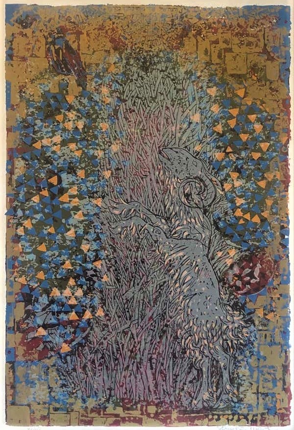
It is a fantastic piece of art! Twenty inches tall and fourteen inches wide (that’s the image area; I think the paper underneath is 27″ x 19″), it’s a 1970 serigraph, which is the fine art name for a screen print on paper. I need to admit right up front that serigraphy is my least favorite form of printmaking. It’s the same technology as t-shirt printing, and it’s pretty limiting as a medium. I’ve made some serigraphs, but only because I was required to as part of my printmaking education for an art major. I’ve also printed t-shirts on a production line, and the commercial process felt about the same to me as the studio process: photographic transfer, squeegee the viscous ink through the screen, let it dry, apply the next layer. I’m just not a fan of the results that serigraphy naturally lends itself to. It compares poorly to all other print processes: not as organic and visceral as woodcut, not as delicate as any of the intaglio media (etching, engraving, drypoint), and nowhere near the endless textural possibilities of lithography. It would take a really great craftsman to make masterpieces in the medium of screen prints.
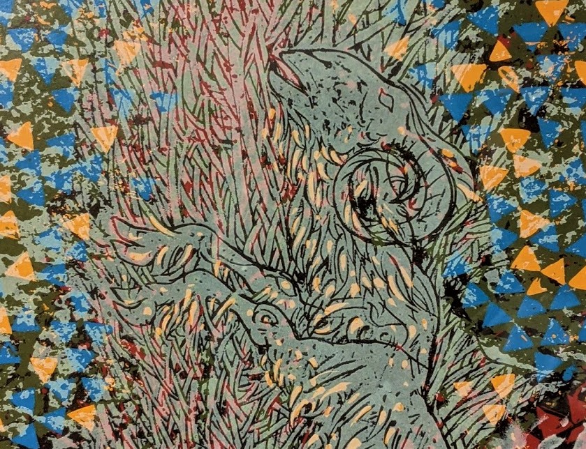
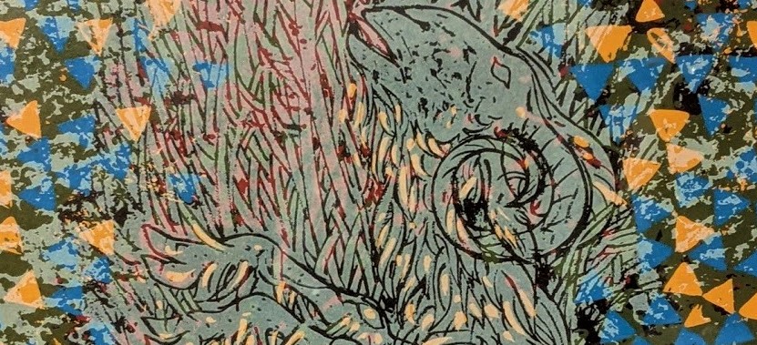
Well, that’s what Shraga Weil did. This piece drew me in when I saw it, and the longer I looked, the more I found to admire. Serigraphy lends itself to bright, distinct colors and clear lines, which Weil makes the most of. I think I can count at least seven distinct layers of color: from a deep red as a bottom color, up through two blues that also seem to have been laid down early in the sequence, and a subtle olive green. There is a chalky off-white layer that Weil laid down on top of all the other colors, and mostly huddled in the central shapes of the ram and thicket. And there’s a critical black layer that is mainly devoted to the line work. The line work is good, almost like relief printing: there is a solid drawing at the center of this image, and the way Weil has chosen to portray the stalky thorn bush makes the most of it.
Radiating explosively out from that central drawing is a busy network of triangles in blue and orange –these little forms, vigorously applied, are responsible for most of the print’s dynamism. (According to his website, Weil did study the mosaics of Ravenna, and these triangles strongly evoke the tesserae of that city’s fifth-century Christian art.)
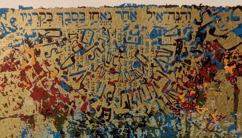
And imposed over all of it, in what seems to be the top layer (that is, the last color applied), is a highly-patterned gold layer that is thickest around the edges of the image, boldly struggling to confine the radiating triangles, but ultimately just barely serving to frame them. At the bottom of the image, the gold layer is subdivided like bricks (for an altar?); near the top the rectangular blocks seem more like a cityscape; and up at the very top of the image the golden mark-making contracts and coalesces into Hebrew writing, with a mixture of blocky text and more elongated, calligraphic letter forms, arranged in downward-radiating semi-circularly.
The gold-colored layer is glossy and just metallic enough to play some of the ocular tricks real gold plays: in some light it tilts toward orange, and is hard to distinguish from the orange triangles, but in other light or from another angle it tilts toward and blends with the green.
This is an absolutely masterful serigraph, and since it won me over to greater respect for the whole medium, let me tell you what a great serigraph can do.
A screen printer has to plan each color as a complete statement that addresses the entire picture plane. The bottom, red layer is 14″ x 20″; the top, gold layer is 14″ x 20″; every layer between them is also a monochrome pattern that populates the whole rectangle, selectively. In the printing process, these drop onto each other in a stack, and this sets up complex patterns of interaction among planes that were conceived distinctly. You can always study any single square inch to see which colors are colliding there, and close inspection will show you the order in which they were applied, as well as whether they overlap or jigsaw into each other. That’s instructive, but what the color interactions in that square inch don’t show you is how each of those colors belongs, not just to the colors around it, but to the entire extension of its own color layer.

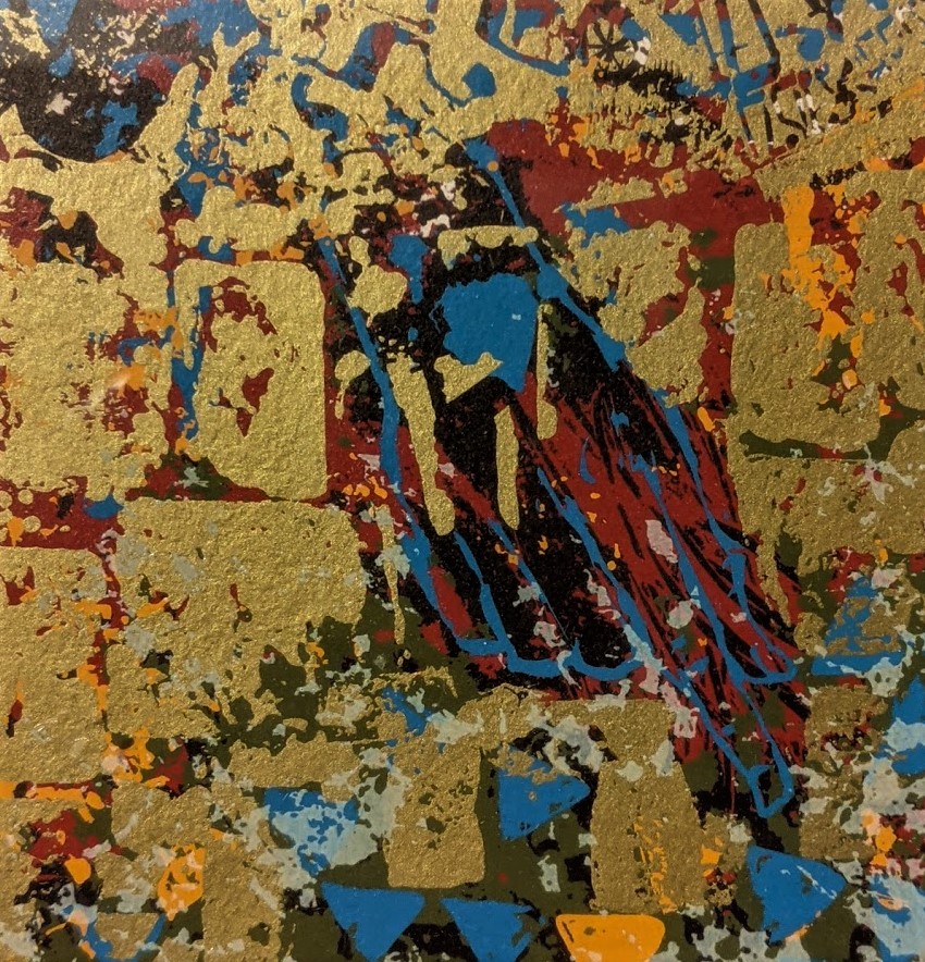
(Here, by the way, is about a square inch of the print, where you can see some of the relationships I described–check out how the gold bridges the green and the orange. I took this particular detail shot because it documents an imperfection in the print I own: Notice the splattering or smearing effect on some of the white shapes. That’s an error that crept into the printing process. Possibly the screen wasn’t being held snugly enough against the paper when the ink was squeegeed through, which allowed the ink to wick out to the wrong part of the back side of the screen; possibly that had happened on the previous print and the screen didn’t get the cleaning it needed between impressions. Whatever the cause, it’s a glitch in the craft because it is uncontrolled, unreproducible mark-making. As a former print-maker, I’m honor bound to disapprove of such lapses in quality control. But as an owner I kind of like it.)
Okay, the layers of color. Let me put it this way: each color layer is like an isolated audio track from a music recording session. Let the red and green be the drum and bass; let the gold and orange be acoustic or rhythm guitar; let the black and white be the vocal and a lead instrument, and so on. During the printing process, each of these colors was actually printed by itself for a materials test run, and then thrown away. And the point of my analogy about isolated tracks is not just that this is something you could do, but that it would be meaningful to do so. It would not be meaningful to do this with most good paintings: an isolated blue or black track of Van Gogh’s Starry Night would not be revelatory. An isolated yellow map would just show you where the yellows are, and that might be cool, but here’s the thing: the yellows in a painting weren’t thought out as an interconnected screen of yellow. They were deployed around the surface of the painting in a developmental dialogue with the other colors; a good painter takes care to distribute them broadly and to modulate them variously depending on their surroundings. But screen printers have a single rectangle of each color as their fundamental architecture. And screen printers don’t modulate their hues: it’s one big grid of the exact same color, applied by squeegee. To come back to an audio analogy again, each color screen has its own dynamics going on, which in theory goes to all four corners of the image. And then they interact.
Before I turn from this print’s craft to its iconography, here is another detail worth inspecting: I’ve praised the line-work in Weil’s drawing, but notice the two kinds of lines he uses:
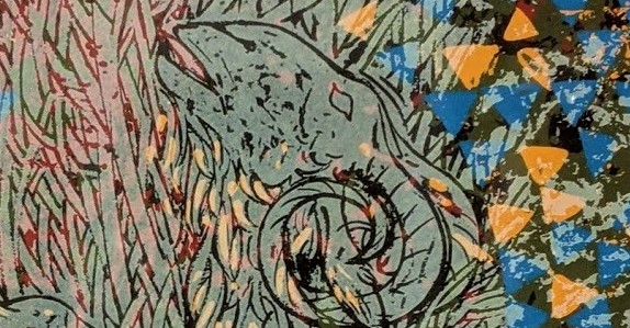
The outline of the goat head is made of black ink lines, printed on top of all the other colors. It’s the kind of line-work you could do with a good sharpie maker, though it’s got a nice, woodcut feel in its varied thickness and mottled shading on the ram’s face. But the lines that Weil drew the thorn bush with are not printed black lines. Look at them: they’re blank spaces in the white ink. They let the underlying colors show through, because the lines of the bush are not made by printing black ink, but by not-printing white ink. It’s a subtle difference because the character of Weil’s drawing is consistent throughout: his lines are shaped a particular way in this central drawing of the ram in the thicket. But the two kinds of lines are produced by opposite printing techniques; one additive, the other subtractive. While we’ve got this detail in front of us, look at the little licks of pale orange shading on the ram’s beard. Do we behold a ninth color? No: this is the normal bright orange, with white printed on top of it. The giveaway is the orange triangles just behind the ram’s head: they are bright orange except where white printing covers them, and the bands where the white layer turns them frosty are obvious. Weil’s restraint in using this bonus color is remarkable: he reserves it almost exclusively for that painterly series of flecks that highlight the long hair of the ram’s wooly underbelly, from his chin to his tail.
Shraga Weil was very much a Jewish artist. Born in Czechoslovakia, he immigrated to Israel in 1947, lived and worked on a kibbutz, and produced the sculptural copper doors for the Knesset building. His website is in Hebrew, and the Safrai Gallery that handles his art is in Jerusalem. As a painter, sculptor, and printmaker, his iconography ranged widely, but returned regularly to images and themes from the Hebrew Bible: the Exodus, the Song of Songs, Ecclesiastes, King David, and, as in the print here, the story of Abraham. Specifically, this image we are studying has the title Akedah VI (The Ram in the Thicket). It is second to last image in a series of seven prints illustrating the story of Abraham’s binding (Heb. akedah) of Isaac, from Genesis 22. Weil picks out the following scenes:
- Akedah I: Abraham’s Dream
- Akedah II: And they Went off Together
- Akedah III: On the Third Day
- Akedah IV: Abraham Put the Wood on his Son
- Akedah V: Where is the Sheep
- Akedah VI: The Ram in the Thicket
- Akedah VII: Because You Have Not Withheld Your Son
You can see larger versions of each image (and buy them!) at the Safrai Gallery website, but these tiny versions will give you a sense of how Weil illustrates the sequence:
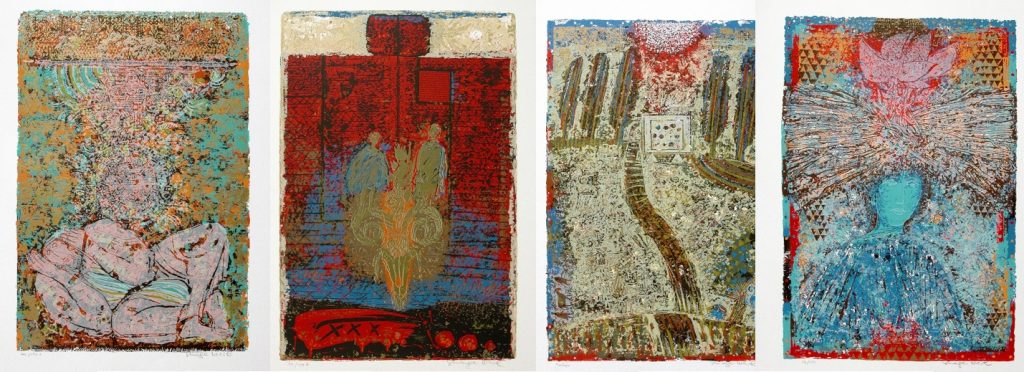
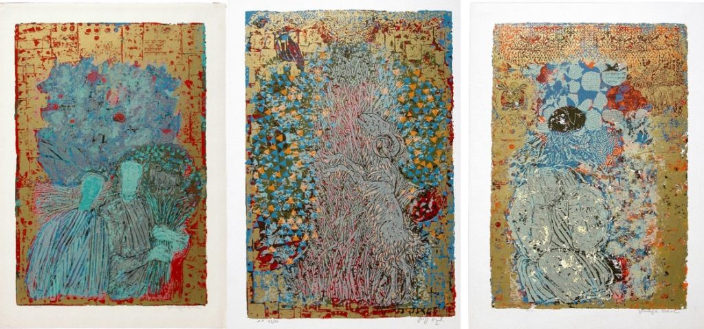
They’re each striking, and deserve close study. By some providence, the one print I found at a discount price in Southern California is the one I like best of the seven, both because of its natural imagery and because of its theological resonance with my Christian faith.
As for Weil’s Jewish faith, and how he interpreted the story, I do not know much. He worked with this akedah imagery repeatedly from the 1960s on, doing several oil paintings and print series, never quite repeating himself in how he handled the story. The book about his printmaking says that “Weil had lost a son and knew the bitterness of bereavement, so the Akedah became an autobiographical subject central to his work.” (Shraga Weil: Sixty Years of Printmaking, preface by Gideon Ofrat, English trans. Malka Yegendorf (Jersualem: Safrai Fine Art Gallery, 2000), 14). It seems to me that Weil did bring a spiritual and theological interest to his treatment of the theme, but the personal and national and literary aspects are also present here. I cannot tell quite what Weil thought the meaning of Genesis 22 was, or if he took it to be a divine word in any concrete sense. The same book, speaking perhaps of this print series but perhaps of another of Weil’s approaches to the akedah, quotes Weil as saying “The angel does not appear in my painting. His absence is significant because in reality there is no angel there… the thicket is fate, the fatality of things. In my painting the ram is the sacrifice and there is almost no difference between the human victim and the ram. This is not the way it is in the Bible… I want to leave it open at the moment Abraham struggles with the bitter fate of the command to offer up his son. What happens after that struggle is just everyday life.” There are a number of confusing comments in the brief text of the book about Weil’s prints, comments that seem to presuppose Isaac’s death. But Weil’s remarks about fate, everyday life, and what happens “in reality” as opposed to “the way it is in the Bible” very helpfully situate him in a looser theological milieu, one that treats the biblical foundation of Jewish life as material to be explored and lived with rather than interpreted as the living word of a present God.
But the claim that “in reality there is no angel there” is a bad fit not just with biblical reality, but with this print I have decided to hang in my living room and live with for a while. For one thing, there is a large, blue hand coming out of the sky and pointing to the ram. The hand, with prominent index finger, is tangled up in the complex, layered mark-making at the top left of the image, but it’s definitely there:
And what am I to make of the energetic triangles exploding out from the miraculous, negative-space thicket, framed in gold whose own negative space is divine words in Hebrew? I can hardly take all of this to be fate. If the multicolored excess is “the fatality of things,” then things have a fatality that is capable of an unspeakable figuration and transfiguration. Perhaps, as Weil turned the akedah over and over in his work, like Kierkegaard turned it over and over in Fear and Trembling, he produced multiple versions with multiple possibilities. The pointing finger reaching down from the top corner of this print simply has to be a cipher of divine intervention, or at least illumination of how things really are. The bush seems to burn more like that of Moses than of Abraham. And the ram himself, upright and vigorous, more carrying the wood than carried on it, seems to speak of something better than the fatality of things.
But a piece of art that you put on your wall doesn’t have to give up all its secrets at once. It lives with you, you live with it, and you keep coming back to the same image as the years go by. Different aspects of it dawn on you in different seasons, under different conditions of light and weather. I am very happy to be sharing some space with Shraga Weil’s Ram in the Thicket.
One last note: the signed and numbered print I’ve got is number 43 in an edition that has 150 prints. You can still find it, number 43 itself, around the internet at a crazy, jacked-up price, but rest assured it’s off the market and living at my place. You can also find versions of the image labelled AP, that is, artist’s proofs that were produced at the same time but are not part of the numbered edition.